UX DESIGN · FRONT-END DEVELOPMENT
Finding Good Matcha Is Hard
Finding Good Matcha Is Hard
so I designed a better way to find it.
A mobile-first café discovery site designed and developed from the ground up to make finding the right matcha spot simpler, faster, and more accessible.
A mobile-first café discovery site designed and developed from the ground up to make finding the right matcha spot simpler, faster, and more accessible.

the pocket-sized version

behind the pixels
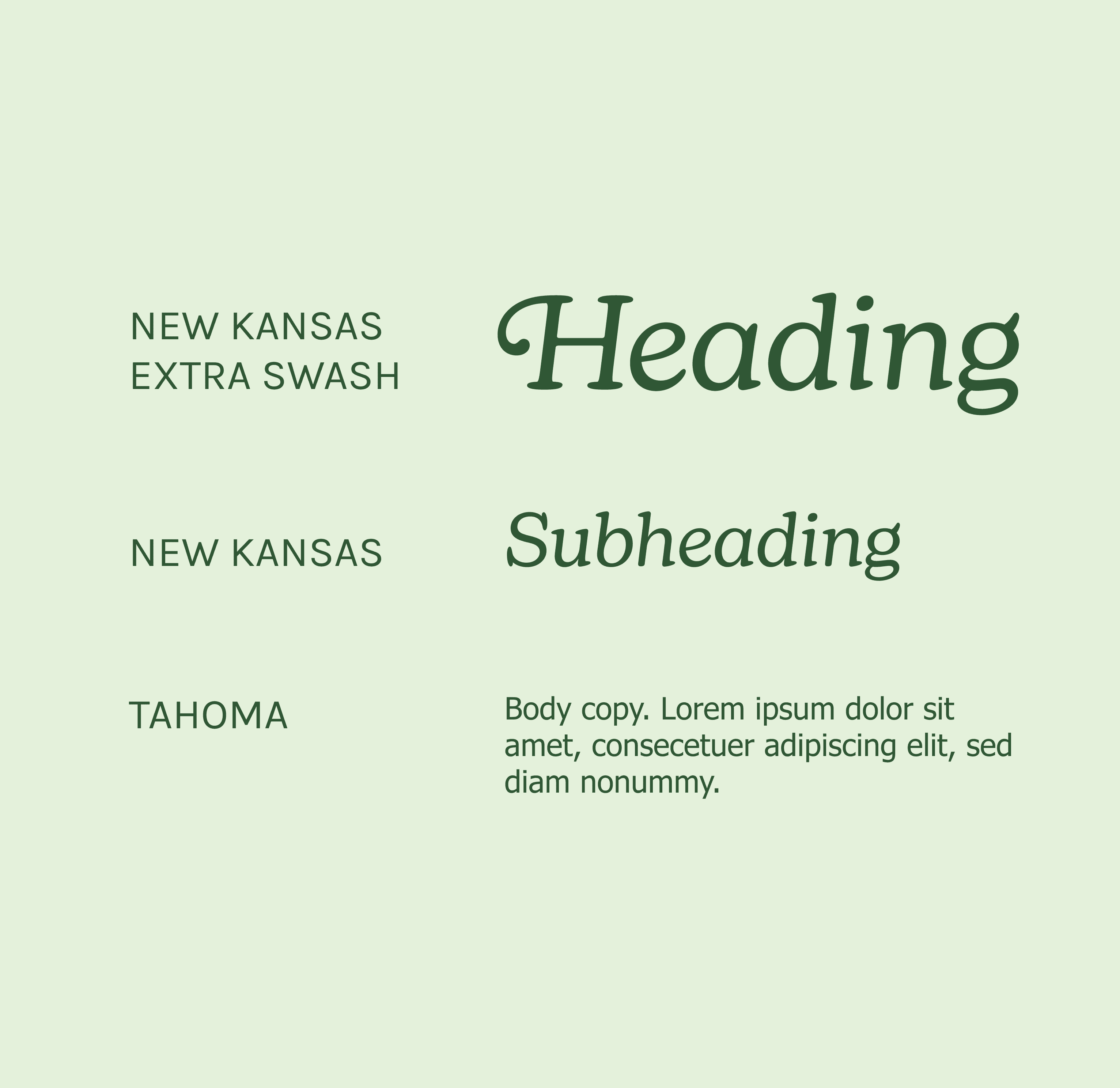
finding its voice

the good stuff, card by card

a little color theory
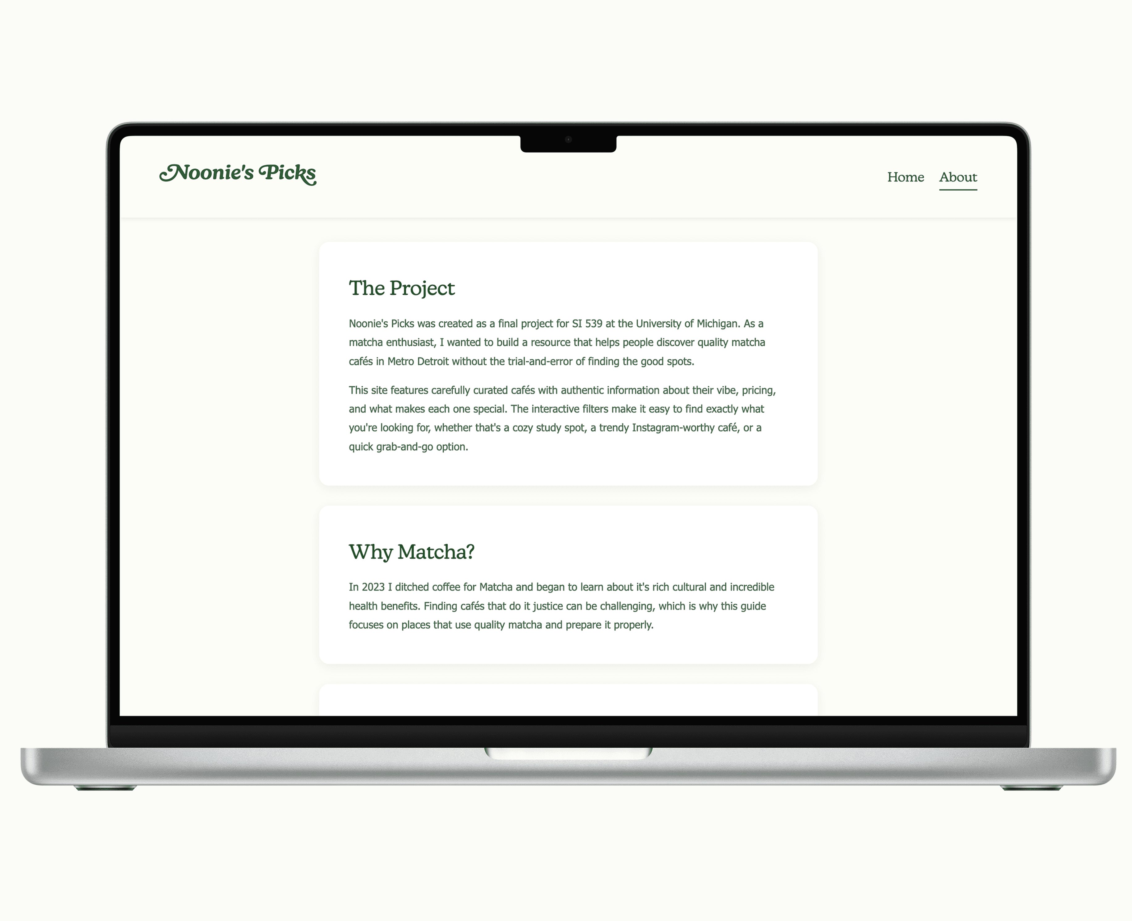
the big-screen version
↔ hover to pause · click + scroll to browse
↔ click to pause · click + scroll to browse
The Problem
The Problem
Most café discovery platforms are designed to help you find everything which can make finding one specific thing surprisingly difficult. For someone looking for a genuinely good matcha, that often means digging through generic reviews, menus, and search results before knowing whether a café is worth visiting. Existing platforms can also introduce usability and accessibility barriers that make a seemingly simple decision harder than it needs to be.
Most café discovery platforms are designed to help you find everything which can make finding one specific thing surprisingly difficult. For someone looking for a genuinely good matcha, that often means digging through generic reviews, menus, and search results before knowing whether a café is worth visiting. Existing platforms can also introduce usability and accessibility barriers that make a seemingly simple decision harder than it needs to be.
The Solution
The Solution
Audited existing café discovery platforms to identify usability, accessibility, and information-hierarchy gaps.
Designed a focused, mobile-first browsing experience that makes comparing cafés quick and easy without overwhelming the user.
Created filters around the decisions that actually matter, including location, atmosphere, and price.
Built accessibility into the interface from the start, considering contrast, readability, hierarchy, and navigation patterns throughout the design.
Designed and developed the full experience independently using HTML, CSS, and JavaScript, refining the interface as I moved from concept to working product.
Audited existing café discovery platforms to identify usability, accessibility, and information-hierarchy gaps.
Designed a focused, mobile-first browsing experience that makes comparing cafés quick and easy without overwhelming the user.
Created filters around the decisions that actually matter, including location, atmosphere, and price.
Built accessibility into the interface from the start, considering contrast, readability, hierarchy, and navigation patterns throughout the design.
Designed and developed the full experience independently using HTML, CSS, and JavaScript, refining the interface as I moved from concept to working product.
My Role
My Role
RESEARCH
Competitive platform audit
Usability & accessibility review
RESEARCH
Competitive platform audit
Usability & accessibility review
UX/UI DESIGN
Information architecture
Visual identity & interface design
UX/UI DESIGN
Information architecture
Visual identity & interface design
DEVELOPMENT
TML / CSS / JavaScript
Independent front-end build
DEVELOPMENT
TML / CSS / JavaScript
Independent front-end build
ACCESSIBILITY
Contrast & readability Accessible navigation patterns
ACCESSIBILITY
Contrast & readability Accessible navigation patterns
The Outcome
The Outcome
The result was a fully designed and developed mobile-first experience that turns finding good matcha from a scavenger hunt into a focused browsing experience. Built independently from research through implementation, Noonie’s Picks gave me the opportunity to carry the same decisions across UX, visual design, accessibility, and code — rather than treating them as separate parts of the process.
The result was a fully designed and developed mobile-first experience that turns finding good matcha from a scavenger hunt into a focused browsing experience. Built independently from research through implementation, Noonie’s Picks gave me the opportunity to carry the same decisions across UX, visual design, accessibility, and code — rather than treating them as separate parts of the process.
Duration
Duration
3
Weeks
3
Weeks
Final Project
Type
Final Project
Type
Tools
Tools
VS Studio Code · GitHub · WAVE Evaluation
VS Studio Code · GitHub · WAVE Evaluation
WHAT I’D DO DIFFERENTLY
I’d start the JavaScript implementation earlier, giving myself more time to troubleshoot challenges with the filtering logic and refine the experience without feeling rushed.
I’d start the JavaScript implementation earlier, giving myself more time to troubleshoot challenges with the filtering logic and refine the experience without feeling rushed.