PRODUCT DESIGN · CONSUMER APP
PRODUCT DESIGN · CONSUMER APP
Making The Brand Feel Like Home
Making The Brand Feel Like Home
the flow was there, but the brand wasn't…yet
the flow was there, but the brand wasn't…yet
I translated Paprclip's new visual identity into a cohesive product system, redesigning its core flows without losing the structure that laid the foundation of the app.
I translated Paprclip's new visual identity into a cohesive product system, redesigning its core flows without losing the structure that laid the foundation of the app.

where it landed

the office, most days
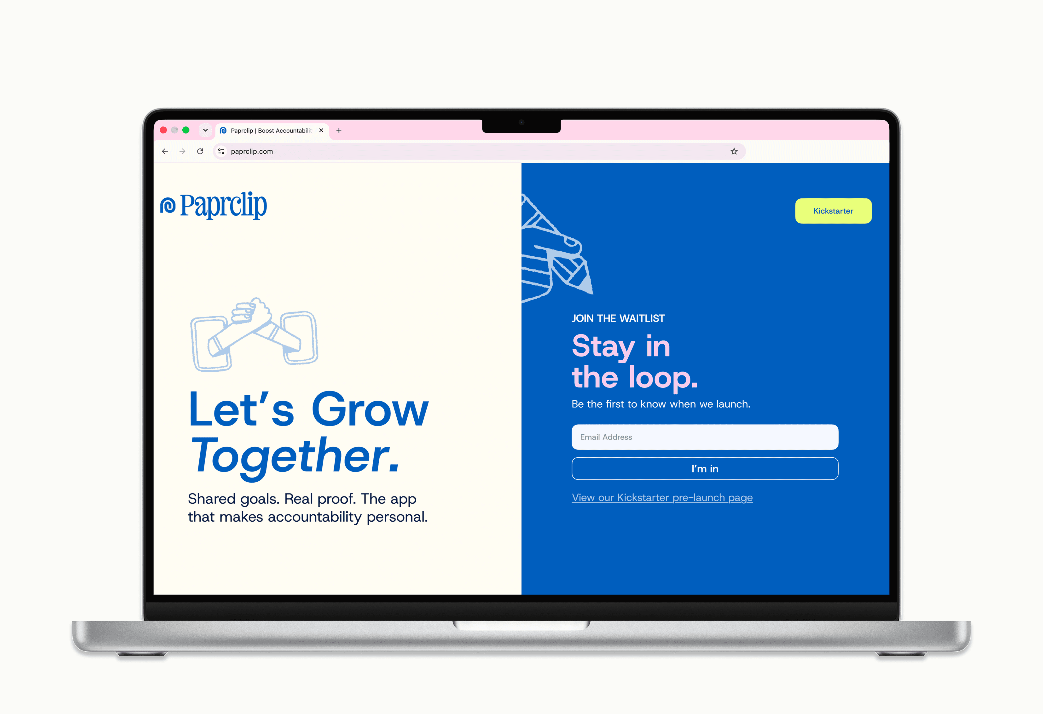
first thing I shipped

building the system

where the mess happens

putting it all together
↔ hover to pause · click + scroll to browse
↔ click to pause · click + scroll to browse
The Problem
The Problem
Paprclip had a new visual identity, but the product hadn't caught up. The existing design already had its core flows in place, but visually, it still belonged to an earlier version of the brand. The challenge wasn't to rethink how the product worked; it was to translate a playful new identity into an interface that still felt intuitive, consistent, and ready to scale.
Paprclip had a new visual identity, but the product hadn't caught up. The existing design already had its core flows in place, but visually, it still belonged to an earlier version of the brand. The challenge wasn't to rethink how the product worked; it was to translate a playful new identity into an interface that still felt intuitive, consistent, and ready to scale.
The Solution
The Solution
Explored the visual direction through moodboarding and competitive research, finding a balance between Paprclip’s playful new identity and everyday usability.
Iterated across multiple design rounds, testing shadows, buttons, cards, typography, and other UI treatments before defining the final direction.
Built a reusable component system for buttons, cards, states, and other core elements to create consistency across the product.
Explored the visual direction through moodboarding and competitive research, finding a balance between Paprclip’s playful new identity and everyday usability.
Iterated across multiple design rounds, testing shadows, buttons, cards, typography, and other UI treatments before defining the final direction.
Built a reusable component system for buttons, cards, states, and other core elements to create consistency across the product.
My Role
My Role
RESEARCH & INSPIRATION
Visual research
Competitive mood boarding
Brand-to-product translation
RESEARCH & INSPIRATION
Visual research
Competitive mood boarding
Brand-to-product translation
SYSTEM DESIGN
Component library
Button, cards, & states
SYSTEM DESIGN
Component library
Button, cards, & states
PRODUCT DESIGN
Core app flows
Hi-fidelity UI
Developer ready designs
PRODUCT DESIGN
Core app flows
Hi-fidelity UI
Developer ready designs
COLLABORATION
Brand consultant working sessions
Founder feedback
Iterative design reviews
COLLABORATION
Brand consultant working sessions
Founder feedback
Iterative design reviews
The Outcome
The Outcome
The result was a product that finally felt like it belonged to the new Paprclip brand. I rebuilt the core experience around a reusable component system and carried it across Paprclip's most-used flows. Rather than treating the redesign as a one-time visual refresh, the system created a consistent foundation the product could continue building on with polished, developer-ready screens designed for implementation.
The result was a product that finally felt like it belonged to the new Paprclip brand. I rebuilt the core experience around a reusable component system and carried it across Paprclip's most-used flows. Rather than treating the redesign as a one-time visual refresh, the system created a consistent foundation the product could continue building on with polished, developer-ready screens designed for implementation.
Duration
Duration
13
Weeks
13
Weeks
Internship
Type
Internship
Type
Tools
Tools
Figma · Mobbin · Dribbble · Google Suite
Figma · Mobbin · Dribbble · Google Suite
WHAT I’D DO DIFFERENTLY
I’d trust my own perspective sooner. One of my biggest takeaways was learning that my opinion is part of what I bring to the table, and I shouldn’t be afraid to voice it.
I’d trust my own perspective sooner. One of my biggest takeaways was learning that my opinion is part of what I bring to the table, and I shouldn’t be afraid to voice it.