Claw Machine
|
Claw Machine |
Some fun projects from school, designs done for family or friends, and ones that I've done for fun


-
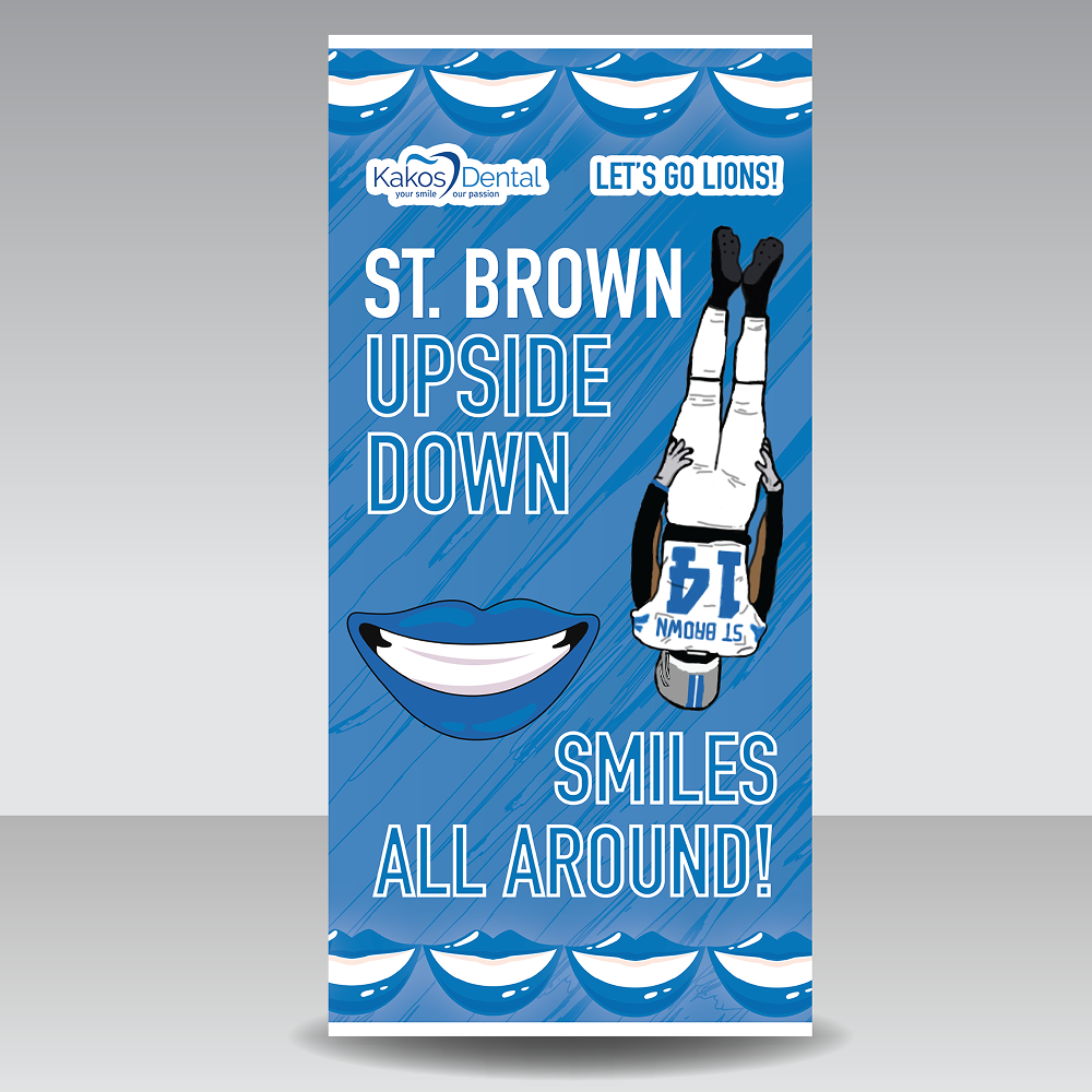
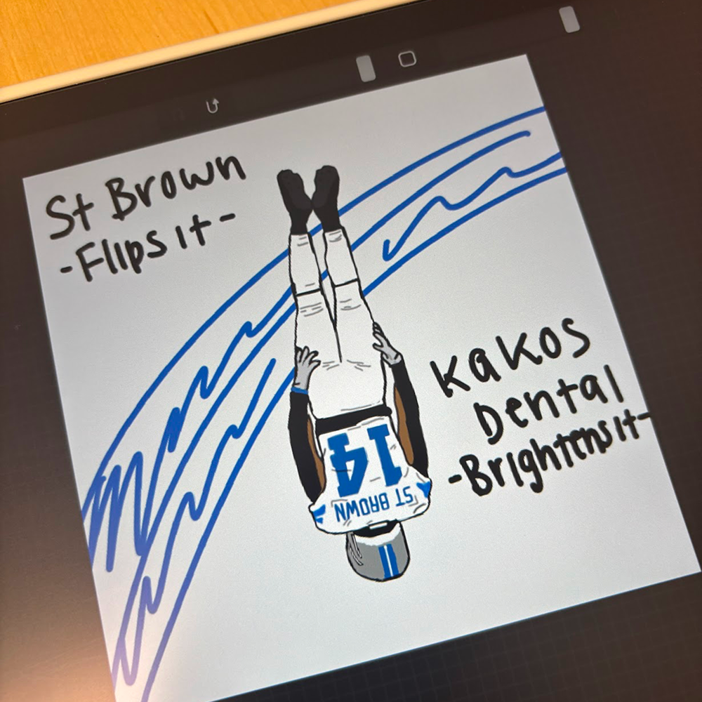
This poster was designed to celebrate a viral touchdown moment by Amon-Ra St. Brown, creatively tying it into the Kakos Dental brand with the phrase “St. Brown Upside Down – Smiles All Around!” The process began with a hand-drawn iPad sketch and evolved into a polished vector design in Illustrator. Custom illustrations, bold typography, and a Lions-inspired color palette brought the concept to life. The final design was printed as a large banner and used in a community-facing display to spread smiles and team spirit.


-
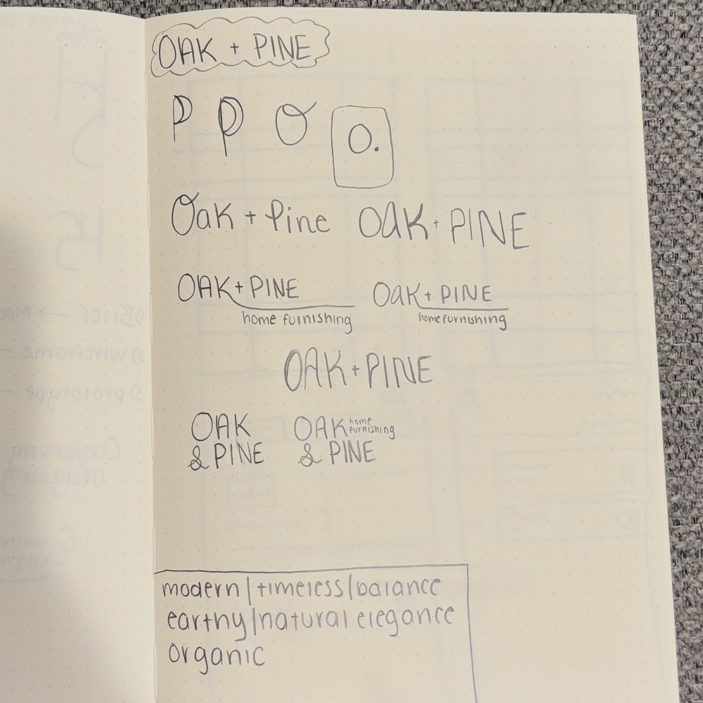
This brand concept for a furniture company plays with soft minimalism and editorial flair. Beginning with hand-drawn sketches, the logo uses an elegant serif typeface with wide spacing to feel airy and upscale—like a boutique showroom. The ampersand was a star element, adding flow and personality. Paired with a muted, calming palette and balanced layout, the typography helps Oak & Pine feel both refined and approachable—just like its furniture.


-
For my intro to graphic design class, I designed a black-and-white movie poster inspired by Don't Worry Darling. I wanted to capture the movie’s true reality instead of the fantasy shown in the original poster. Since I couldn’t use color, I relied on textures and shadows to set the tone. Asynchronous design isn’t something that comes naturally to me, so this project really pushed me out of my comfort zone—but I had a lot of fun with it!


-
This design concept for The Return Xpress logo embodies speed, efficiency, and simplicity. The logo creatively merges a shopping bag and a car, symbolizing the brand’s mission of streamlining online return orders. Using clean, minimal shapes ensures scalability and clarity, while the blue gradient conveys trust and fluidity.


-
For my graphic design class, I created spreads that reflect my personal design style—soft, clean, and minimal. Through sketching, mood boards, and self-analysis, I discovered my love for high-contrast typefaces, textures, and soft colors. I enjoy using lines, balance, and typography to guide the eye and create seamless compositions. This project was a fun exploration of my creativity and cultural influences.