Lakeside Custom Carts
|
Lakeside Custom Carts |
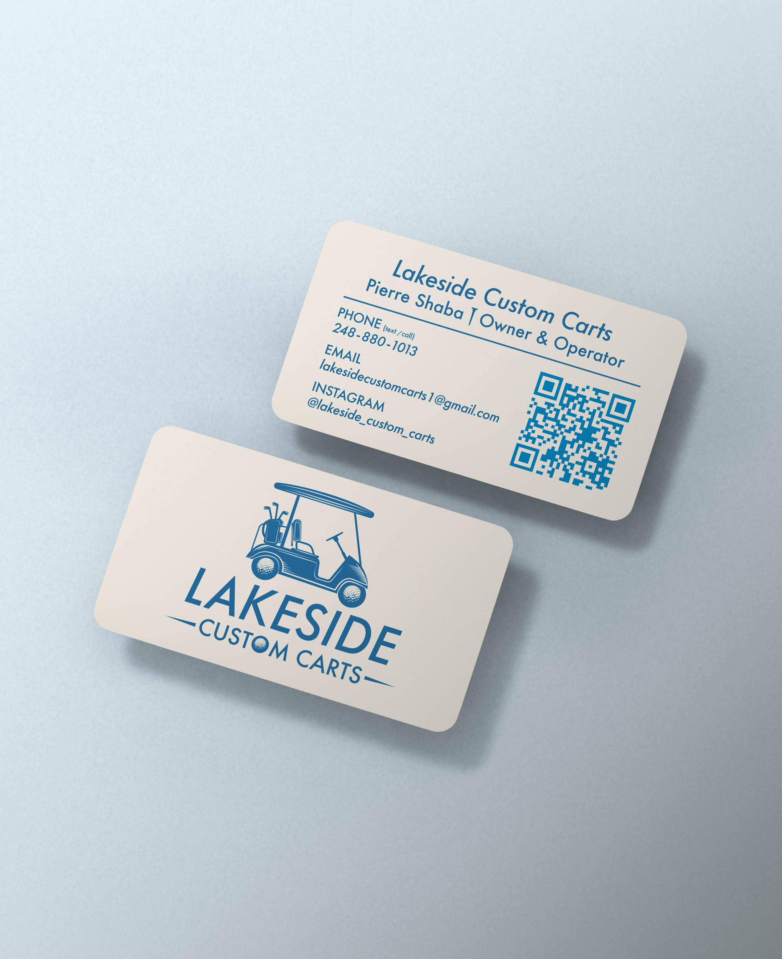
The objective was to design a simple, clean logo and business card system for Lakeside Custom Carts that communicates the business’s purpose.
Client Brief
Developed a simple, legible logo system featuring a golf cart illustration and subtle golf-inspired details to clearly communicate the business’s service at a glance.
Established a clear typography hierarchy and uncluttered layout to ensure the business cards remain readable, functional, and easy to scan.
Selected a lake-inspired blue and neutral color palette to reinforce the brand’s name while keeping the overall identity clean and professional.
Design Process
-
The color palette uses lake-inspired blues paired with soft neutrals to reflect the brand’s connection to water and outdoor leisure. The blue tones add clarity and trust, while the lighter neutrals keep the identity feeling clean and approachable. Together, the palette supports a professional, readable, and timeless visual system.
-
The typography uses Futura (Medium) to create a clean, modern foundation that prioritizes legibility and clarity. Its geometric structure reinforces a professional, straightforward tone while remaining highly readable across print and digital applications. This choice supports the brand’s emphasis on simplicity, function, and approachability.


-
The logo combines a golf cart and golf ball to clearly communicate the business’s purpose at a glance. Simple line work and balanced proportions keep the mark versatile and recognizable across different sizes and formats. Subtle golf references add personality without overwhelming the design, ensuring the logo remains clean, professional, and timeless.